FYBCOM Sem 1 Basic Tools in Economics Chapter 6 Notes 2024 – Graphs and Diagram
FYBCOM Sem 1 Basic Tools in Economics Chapter 6 Notes is Graphs and Diagram.
In this chapter A diagram or a graph in economics is a visual presentation of statistical data that brings out basic trends and helps to analyse the relationships between variables. More specifically, a graph is a diagram of a mathematical function.
The notes we provide for FYBCOM students are not tied to a certain course. Students pursuing FYBAF and FYBMS study similar subjects in their first semester, such as Basic Economics Tools, so these notes are equally beneficial to them. Our detailed notes are meant to make it easier for all students in these courses to understand the important concepts. Whether you are in FYBCOM, FYBAF, or FYBMS, these notes will help you succeed academically.
Q.1 A) Select the most appropriate alternative and rewrite the statement:
1) A/an _______ is an economic measurement that is subject to change. b
a) Parameter
b) Variable
c) Function
d) Intercept
2) Choose the incorrect statement:
a) A parameter is a magnitude that is assumed to change.
b) A variable is a measure that is subject to change.
c) Functions and relations are two different concepts.
d) Functional relations can be direct or inverse.
3) A time series graph explains ______.
a) Random fluctuations in data
b) Data at a point of time
c) Trends in data over a period of time
d) Abnormal fluctuations in data
4) Choose the correct statement:
a) A simple line graph depicts more than one dependent variable.
b) Sub-divided bar diagrams show the percentage share of each component of a data.
c) All bar diagrams use only horizontal bars.
d) Multiple bar diagrams are used to compare to or more variables.
5) _______ is a type of graph representing data in a circular form.
(a) Scatter diagram
b) Pie chart
c) Percentage bar diagram
d) Non-linear curve
Q.1 B) State whether the following statements are true or false.
- All diagrams are graphs. – False
- In the equation C = a + bY, a represents the slope of the consumption line. – False
- There is a difference between functions and relations. – True
- A line graph has is a collection of dots each of which represents a pair of value of two variables. – False
- A line graph has two or more variable individual data points that represent the relationships between variables. – True
- Simple bar diagrams can depict data using both horizontal and vertical bars. – True
- In percentage bar diagrams, each bar has a height representing the value 100. – True
- Graphs and diagrams are perfect tools for economic analysis and do not have any flaws. – False
Answer the following question
1) Define a graph. Explain the construction of a graph.
Answer: A diagram or a graph in economics is a visual presentation of statistical data that brings out basic trends and helps to analyse the relationships between variables. More specifically, a graph is a diagram of a mathematical function
Construction of Graph

The construction of a graph involves several key steps:
1) Identify the Variables: Determine the independent and dependent variables. The independent variables is typically plotted on the x – axis (horizontal), While the dependent variable plotted on the y-axis (vertical)
2) Choose the Type of Graph: Select an appropriate graph type based on the nature of the data. Common types include:
- Line Graphs: Used to show changes over time or relationships between two variables.
- Bar Diagrams: Useful to comparing different groups or categories.
- Pie Charts: Effective for showing proportions within a whole .
3) Set up Axes: Draw the x – axis, labelling them with the respective variables and their units of measurement. This provides context for interpreting the data points plotted on the graph.
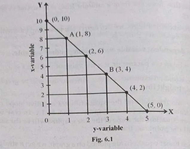
4) Plot Data Points: For each pair of values corresponding to the variables, plot points on the graph. For example using coordinates (x,y) Where x represents the independent variables value and y represents the dependent variables value
5) Connect Points: if using a line graph, connect the plotted points with straight lines to illustrate trends or relationships. In cases of non-linear relationships, curves may be used instead.
6) Add Titles and Labels: Include a clear title that describes what the graph represents. Additionally, label each axis and provide a legend if multiple data sets are represented.
7) Interpret the graph: Analyze the visual representation to draw conclusion about the relationship between variables, noting trends such as increasing or decreasing patterns, and identifying any correlations or anomalies present in the data.
2) Write a note on time series graphs and scatter diagrams.
Answer: Definition and purpose:
A time series graph is a visual representation that plots data points for a single variable at successive time intervals. Each point graph corresponding’s to specific time and the quantity being measured, allowing for the observation of trends over time. For example, a time series graph could illustrate sales figures for a company from 2006 to 2020, showing how sales have fluctuated during that period.
Characteristics
Axes: The horizontal axis (X-axis) typically represents time, while vertical axis (Y-axis) represents the variable being measured.
Data Points: Each dot represents an observation corresponding to a pair of values from the two variables.
Relationship Analysis: Scatter diagrams help in identifying correlation – whether positive negative, or nonexistent – between the two variables. A positive correlation indicates that as one variable increases, so does the other; a negative correlation suggest that as one variable increases, the other decreases.
| Feature | Time Series Graphs | Scatter Diagrams |
|---|---|---|
| Purpose | Shows trends over time for one variable | Shows relationship between two variables |
| Axes | Time on X – axis, variable on Y-axis | One variable on X – axis, another on Y-axis |
| Data Points | Points connected to show trend | Individual points representing pairs of values |
| Analysis Focus | Trend analysis over time | Correlation analysis between variables |
3) Explain the types of line graphs.
Answer: Line graphs are the most commonly used diagrams in economics. They are used to visually depict functional relationships between variables. A line graph has two or more individual data points that represent a series of information explaining the relationship between the variables measured on the X and Y axes. A line graph is also known as a line chart or a line plot.
Types of line graphs
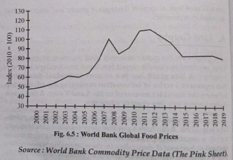
1) Simple Line Graphs: A simple line graph tracks a single dependent variable against an independent variable using a single line. It visually represents the relationship between these two variables, making it easy to observe trends over time. For example, it can show how world food prices have changed from one year to another.

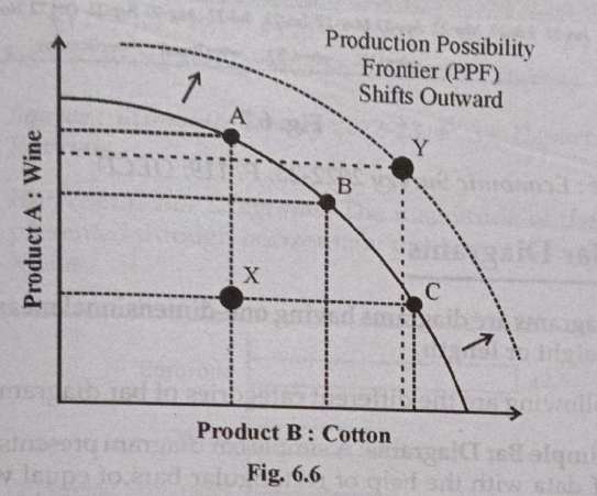
2) Non – linear Line Graphs: These graphs depict relationships where the slope changes at different points, indicating that the relationship between variables is not constant. Non – linear relationships are common in economic data, such as the production possibility frontier (PPF), which illustrate trade – offs between two goods.

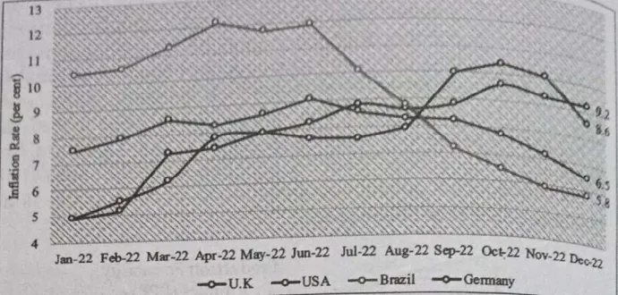
3) Multiple Line Graphs: In a multiple line graph, two or more dependent variable against the same independent variable. Each variable is represented by a different coloured lines facilitating direct comparison between datasets. For example, inflation rates across different countries can be plotted on the same graph to analyze trends and differences

4) Discuss the different types of bar diagrams.
Bar diagrams are popular way to visually represent data, particularly in fields like economics.
They help to simplify complex information and make comparisons easier. Here’s a breakdown of the different types of bar diagrams:
Types of Bar Diagrams
1) Simple Bar Diagrams: These diagram use rectangular bars of equal width to represent data categories. Each bar corresponds to single figure , making it straightforward to understand one characteristic of the data.
- Vertical Bar Diagram: Bars are positioned vertically, with the height representing the magnitude of the data. For example, a diagram showing monthly GST collections uses vertical bars to indicate different fiscal years.
- Horizontal Bar Diagram: In this format, bars are laid out horizontal, with their lengths indicating the data magnitude.
2) Multiple Bar Diagram: This type compares two or more variables using either vertical or horizontal bars. Different colour codes are often used to differentiate between the datasets visually. For example, a diagram might show various types of imports over time distinct colours for each category.
3) Sub-Divided Bar Diagram: These diagrams break down a single bar into multiple segments, each representing a component of the total data. This allows for easy comparison of parts to he whole such as displaying population demographics by age or gender within a single bar.
4) Percentage Bar Diagram: Similar to sub divided diagrams, these represent components as percentages of a whole. Each section of the bars reflects its share relative to the total, making it useful for understanding proportions within a dataset.
5) Explain the importance and disadvantages of diagrams and graphs.
Answer: Diagrams and graph play a crucial role in data presentation and analysis, particularly in fields such as economics. Their importance and disadvantages can be summarized as follows:
Importance of Diagrams and Graphs
1) Easy to Understand: Diagrams and Graphs transform lzrge volumes of complex data into visual formats that are easier to understand. This especially beneficial in economics, where data can be intricate and voluminous, making it difficult to interpret through tables alone.
2) Identification of Trends and Relationships: They help in identifying trends, patterns, and relationships between variables at a glance. For example, line graph can illustrate how one variable changes in relation to another over time , making it easier to analyze cause and effect relationships.
3) Enhanced Communication: Visual representations facilitate better communication of information. They allow for quicker comprehension and retention of information compared to textual descriptions, which can be lengthy and complex.
4) Comparison of data: Bar diagrams and multiple line graphs enable easy comparison between different datasets or variables. This is useful for analyzing differences across categories or over time, enhancing decision making processes.
5) Support for Economic Analysis: In economics, understand graphs is essential for grasping theories and models that describe economic behaviour. Graphs provide a visual context that complements theoretical concepts.
Disadvantages of diagrams and graphs.
1) Oversimplification: While diagrams simplify data, they can also lead to oversimplification. Important detail may be lost in the visual representation, potentially leading to misinterpretations.
2) Mislead Representations: Poorly designed graphs can mislead viewers. For example, inappropriate scaling or selective data presentation may distort the true nature of the data being represented.
3) Dependency on Visual Literacy: The effectiveness of diagrams relies in the viewers ability to interpret the correctly. Individuals lacking experience with graphs may struggle to extract meaningful insights from visual data presentations.
4) Limited Scope: Some complex relationships cannot be effectively captured by simple graphs or diagrams. Non-linear relationships or multi-variable interactions may require more sophisticated representations that are not easily conveyed through basic graphical formats.
5) Data Quality Issues: The accuracy of diagrams depends on the quality of the underlying data. If the data is flawed or biased, resulting graph will also be misleading, regardless of how well it is designed۔
You can download the Basic Tools in Economics book pdf – Click here
Video Solution of FYBCOM Sem 1 Basic Tools in Economics Chapter 6 Notes 2024 – Click here
Related Posts :
FYBCOM Subjects
SYBCOM Subjects
TYBCOM Subjects
FYBCOM Syllabus
SYBCOM Syllabus
TYBCOM Syllabus
FYBCOM books pdf
SYBCOM books pdf
TYBCOM Books Pdf
Pingback: FYBCOM Sem 1 Basic Tools in Economics Chapter 7 Notes 2024 | FYBAF | FYBMS - Mumbai University - University Solutions
Pingback: FYBCOM Sem 1 Basic Tools in Economics Chapter 4 Notes 2024 | FYBAF | FYBMS - Mumbai University - University Solutions
Pingback: FYBCOM Sem 1 Basic Tools in Economics Chapter 8 Notes 2024 | FYBAF | FYBMS - Mumbai University - University Solutions